HOME DECOR IDEAS
For many of us, the hours spent at home have risen sharply in
recent weeks as we adjust to life during the Covid-19 pandemic.
With our homes now acting as a place of work, play and everything
in between, it’s more important than ever to create a sense of calm
and ease through our surroundings.
And doing this can be easier than we might think, with one solution
being art, which can make us feel calmer, as well as more hopeful
and inspired.
While there are a huge variety of tiles on the market, when building
or renovating, most of us end up playing it safe with basic white.

A Clever Use of White in the Space
Don’t assume that a darker design plan means a black or grey
canvas. By keeping the shell of the ground floor white, the team
could then get more adventurous with darker flooring, window
frames and cabinetry colors.
One look at the kitchen in this home is enough to make you realize
that it’s well and truly time to move beyond white shaker door
profiles. The black cabinetry not only allows the appliances to fade
into the background, but it creates such a striking contrast between
it and the walnut shelving and veined stone splash back.
The result of this considered color palette is a ground floor
entertainer’s paradise that feels warm and welcoming, while
seamlessly blending the indoor and outdoor spaces. The grey tiles
also go a long way in making the internal and external zones read
as one, and the stunning bi-fold doors don’t hurt either.
Notice there’s not a lot of shimmer and shine here: many of the
materials are matte finish, which keeps it sophisticated without the
blingy feel.
It’s such a misconception to think that dark neutral interior design
in a home means gloomy, or small, or heavy. The photos from this
stunning show home – situation in Sorrento, Queensland – prove
that embracing a moodier palette results in a scheme that’s
anything but dingy.
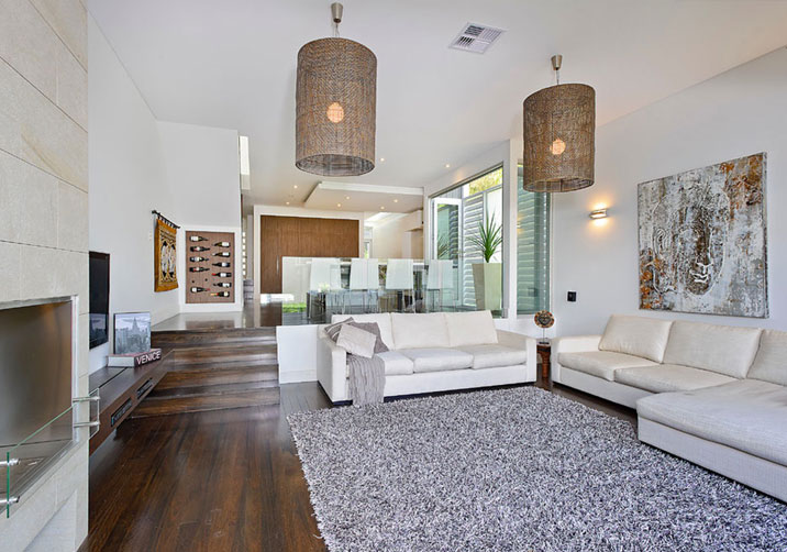
The expansive ground floor of this show home is absolute dark
neutral goals. It’s designed for entertainment and a laidback
lifestyle, with an expansive open plan kitchen, including butler’s
pantry and wet bar. It overlooks the large dining room and alfresco
area, making the entire zone the undisputed hub of the home.
What’s so good about these rooms is how open they feel despite
how many darker elements there are throughout them.
This didn’t happen by accident, of course, but rather through a
clever balancing of colors and materials. Black, charcoal, white
and brown tones all play together wonderfully here, but you’ll
notice white doesn’t completely dominate. The lush greenery you
can see beyond the windows provides a subtle hint of color as
well; keeping the vibe earthy and organic.

Warm Decorative Elements
Sometimes when people choose to embrace a dark neutral interior
design scheme, the spaces lack warmth. Often the rookie error
people make is having a lot of black and then accenting it with
white and metallic like chrome. This can make the room read as
quite cold, especially in zones with tiles or stone.
What the team at Metricon has done in this home though is
introduce a lot of warm colors and materials to balance out those
colder tiles and marble. You’ll notice this in the choice of dining
table and chairs, as well as the wallpaper, window treatments and
accessories in the living room.
Just that little pop of mustard in the velvet cushion on the sofa
above is enough to add some warmth to the space.
Even in the upstairs bedroom you’ll notice how warm and inviting it
feels, even though there are so many dark colors at play. I really
admire the choice of wallpaper in this zone as well. It’s one of the
elements that take your property from house to home. It’s also nice
to see sheer curtains that veer away from white, don’t you think?

Wet Zones are Equally Impressive
The dark neutral interior design ideas just keep coming, and span
well beyond the living space. The bathrooms in this property adopt
that same sense of balance, with gorgeous cool white marble
contrasting beautifully with warm timbers and moody charcoal floor
tiles. Gold accents in the decorative accessories introduce a
warmth and luxury in small moments too.
Even the laundry keeps this darker vibe as well, which is such a
welcome change from all the light and bright laundries we’ve seen
in homes the last few decades. I hope this is a trend that catches
on because it’s a really successful approach.

