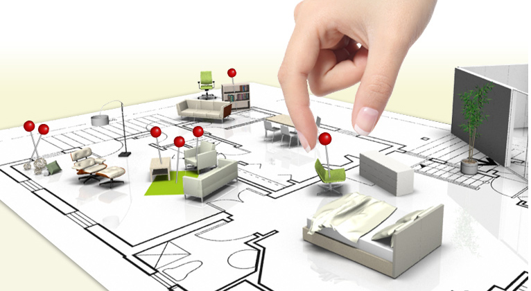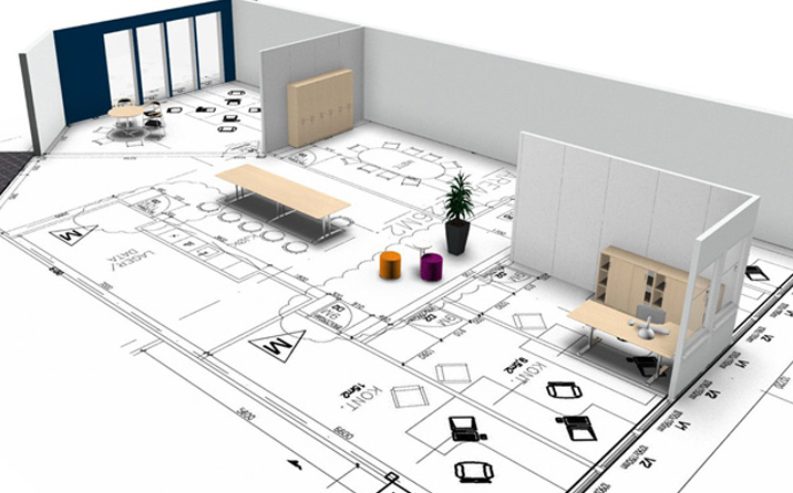
When it comes to redecorating or giving your home a complete make over, space planning is quite crucial and the most fundamental element to interior design. Space planning is an intricate process and requires an in-depth analysis of how the space is to be used effectively. The next step is when the interior designer draws up a plan that defines different zones of space and activities that will take place in these zones. Space planning also defines the circulation pattern that shows how people will move through the space.
When you plan any interior space, not only do you want it to be aesthetically pleasing but you also want it to give you comfort and practicality, as well as being conducive to everyday living.
Before you can create your perfect room it’s a good idea to develop a project brief. Begin by assessing the functional deficiencies or restrictions of the space and try to work out how they may be improved. Think about how the room is used, how you live and move around it. Consider your likes and dislikes and of course, your budget. Be sure you keep in mind that the whole point of spatial planning is to maximize efficiency.
 Once you have an idea about the functionality of the space, you can blend it with your desired visual outcome. Consider colors, furniture placement and accessories etc. It’s all about having a vision of the overall picture and bringing them together, rather than focusing separately on individual elements. Integrating everything well should bring your space a good sense of balance between comfort, beauty and practicality.
Below are three expert tips to think about when trying to master the art of space and what is the room used for? Think about how you position certain items to maximize the ease of use in this space?
The kitchen work triangle is a good example of this concept. The kitchen work triangle is a design concept used to determine efficient kitchen layouts. As you know, main tasks in a home kitchen are carried out between the fridge, cooker and the sink. Ensure pathways between them are direct and unobstructed.
By creating an imaginary triangle between the three elements you can form an efficient and easy space to use. Obviously, there are exceptions to this rule however efficiency can still be achieved through well thought out configurations.
When you walk into a room that looks and feels right it usually means that it has just the right amount of furniture in it. This is a very easy thing to get wrong! Using the correct scale and proportions are vital for a space to be practical as well as visually pleasing.
 Furniture that is too big will obstruct pathways and can interrupt the flow of a space and make it feel cluttered. For example, a large overstuffed sofa crammed into a small lounge room won’t leave much space to move around it so doesn’t work well.
On the other hand, if the furniture is too small creating lot of space between items then it will prove inconvenient and won’t feel warm and inviting. For example, an undersized coffee table probably won’t be appropriate for use by most of the seating in the room. Also, it will look a little lost positioned in the middle.
So, as a general rule a big room can handle large, bulky scale furnishings and a smaller room more petite and delicate items.
Drawing up a floor plan of your room/s to scale will give you a good gauge of the space. It can help with selecting the appropriate size furniture based on the size of the room. It will also give you an idea of which placements will work best.
Here are some crucial steps involved in the process of planning the layout of a room

